TripMate
Overview
It is a good companion for travelers, and its goal is to enable users to realize all travel needs in one product. Users can choose themed trips or customized trips. More importantly, the powerful team travel feature can help more people.

Group
Planning
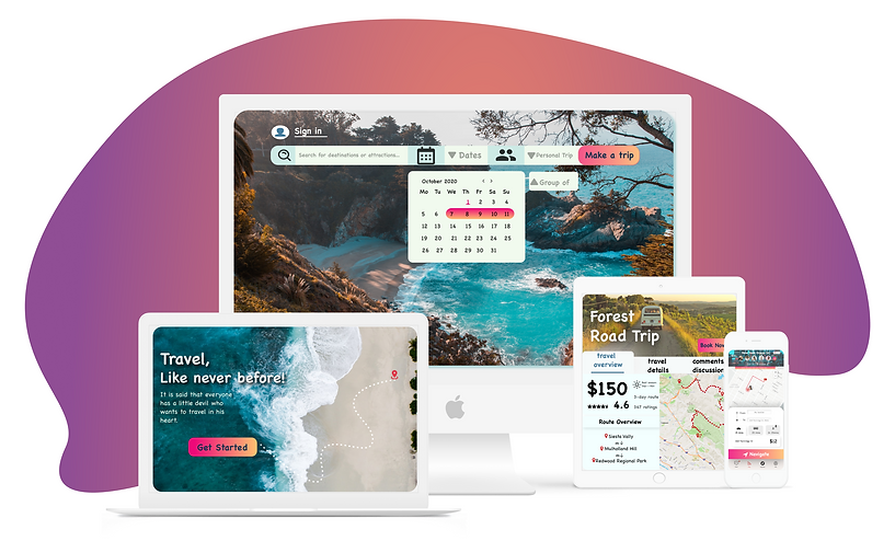
Here's how the team can plan their trip while chatting on the PC. And the travel calendar changes based on the items added to the itinerary and shows the profile pictures of the people who participated in that trip

Mobile phone navigation & Chatting
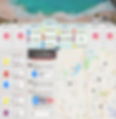
This shows the convenience of mobile products in navigation and chatting when traveling. Users can chat at will and switch between navigation interfaces at any time. And the user can see where the team members are on the map and set up meeting places.

Tickets & Information
storage
It is shown here that the mobile phone product can store tickets and ids needed during the trip, which can reduce the chance of losing important documents.

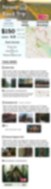
Customized
tour
Here is a customized tour. Users hate having to care about every detail of a trip, and such packaged travel plans can save users the hassle of planning a trip themselves. Users can also modify and add to the interface.
Design Process

The whole design process is a circular process rather than a linear one. Every time after the fifth step, we have to always go back to the empathize part to see if the problems are solved or not.
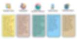
Brainstorming


The brainstorming focused on these five areas. Then some keywords are extracted for brainstorming to guide the focus of the future design.
Market Research

ustravel.org
Quantitative Research

User Interviews

Persona

The two personas are obtained based on the result of marketing research and user research. They are mainly aimed at the two different user types(like age, travel habits, travel needs.)
Empathy Map
What are users experiencing during traveling?

Define the Problem

Design Directions
Mind-mapping

UX Workflow

Wireframs


Desktop
Version
The desktop version focuses on the planning of the trip and the detailed browsing and modification of the customized trip.
Mobile
Version
The mobile version mainly focuses on navigation, chatting, ticket management, and other functions during the journey.

Design Styles

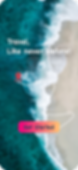
Landing Page
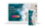
Home Page

Preference Test

Theme Tour
Desktop Itinerary
A/B Testing


The original idea was that the map was the key feature because the location of each project was important. The second reason is that for the symmetry of the interface, chat, and lists should be on either side of the map.
Then I showed the two designs to my users and let them try to use it, and then... I got my final design.
Final Design for Desktop Itinerary

In addition to the user's feedback, the final reason for choosing this scheme is that, more importantly, the human-computer interactions here is mainly to drag the items in chatting diagrams to the itinerary list. So chat boxes and lists should be put aside.
Final Mobile Designs